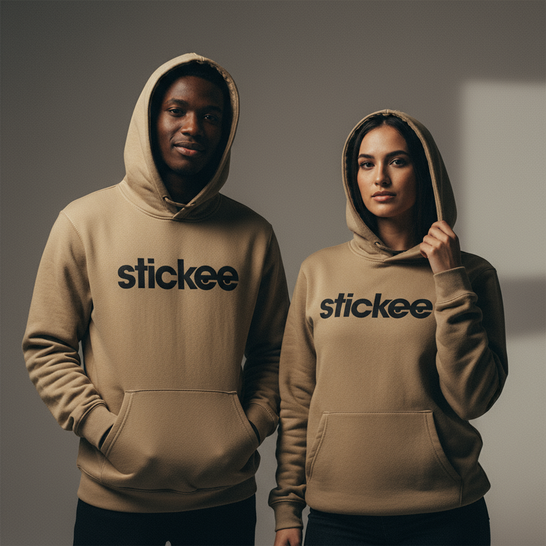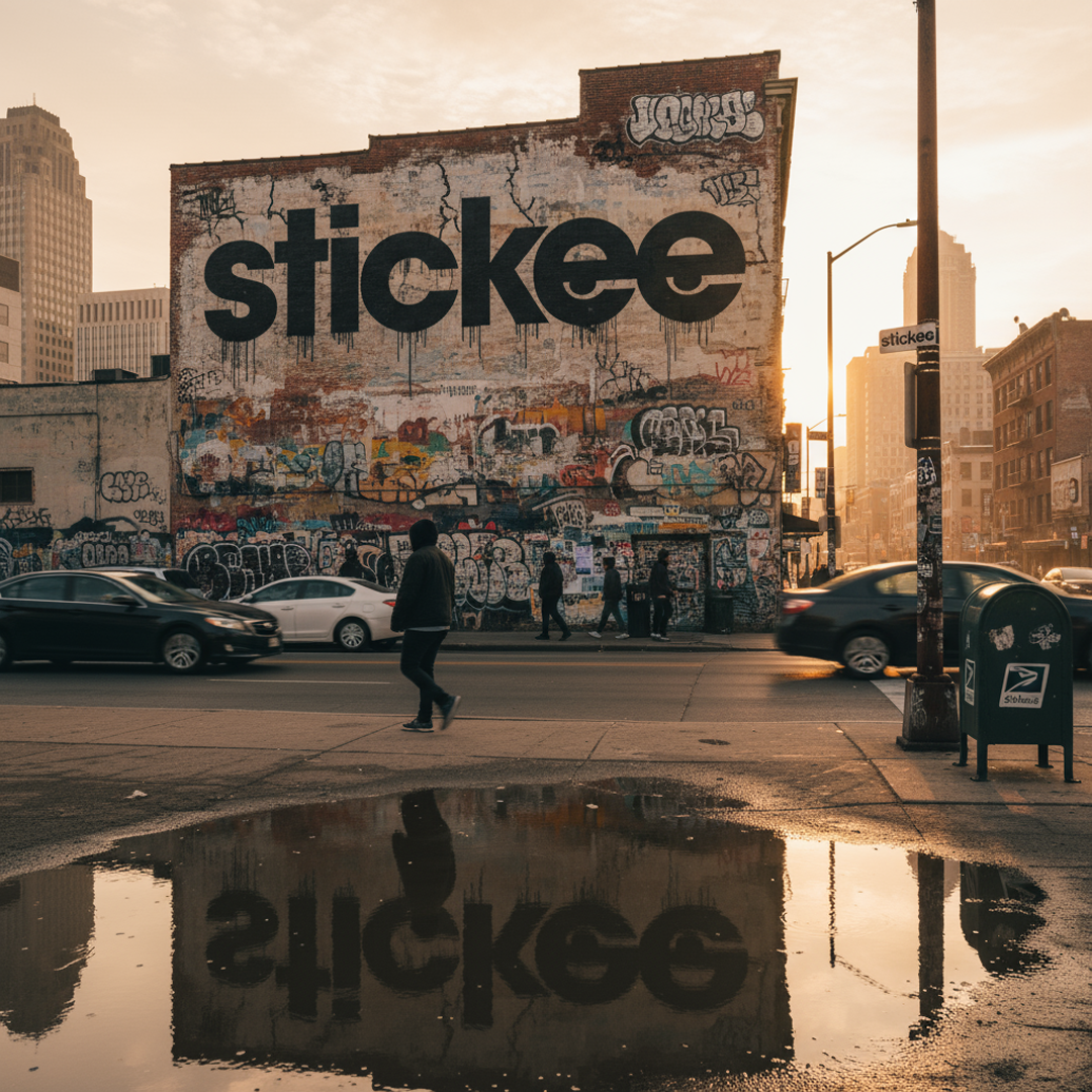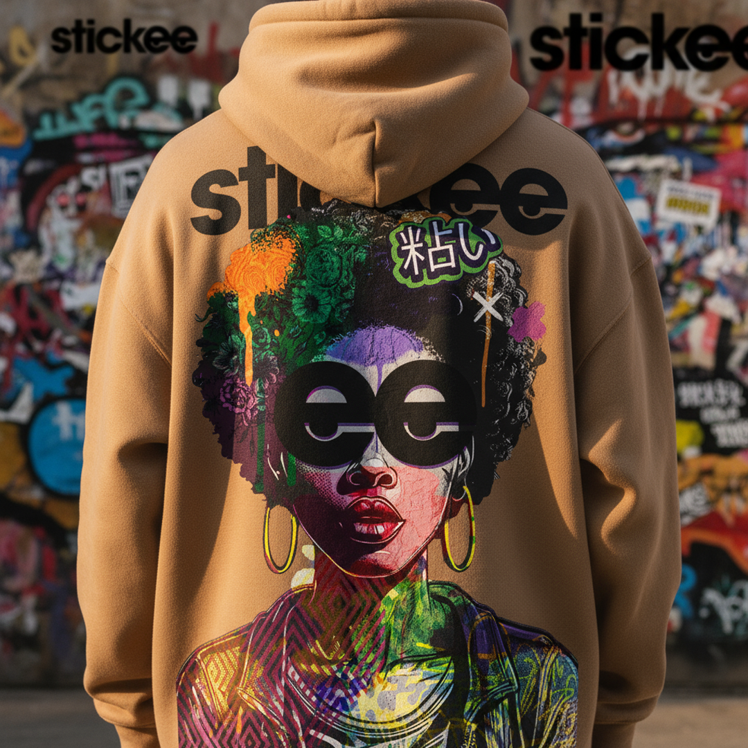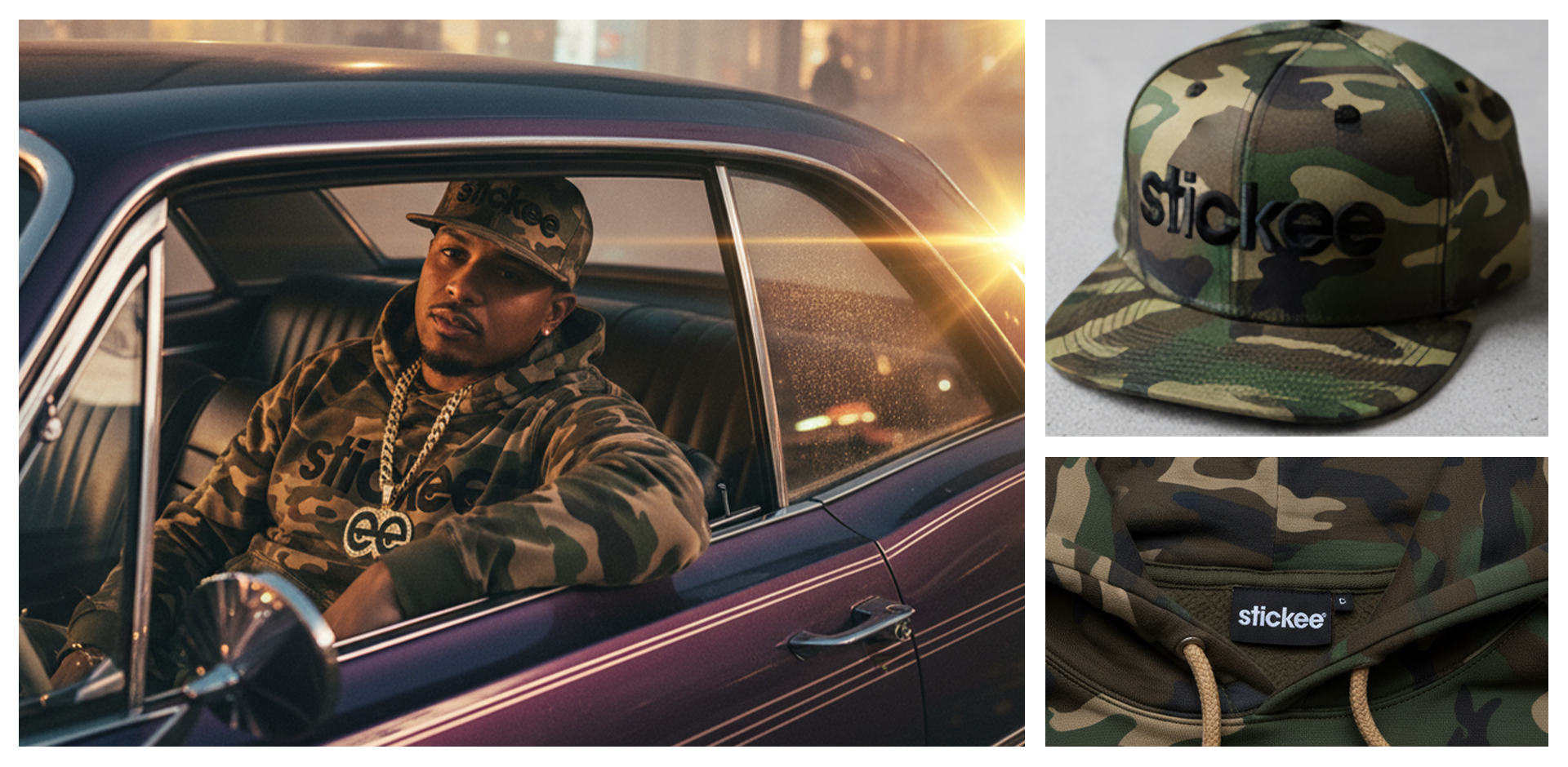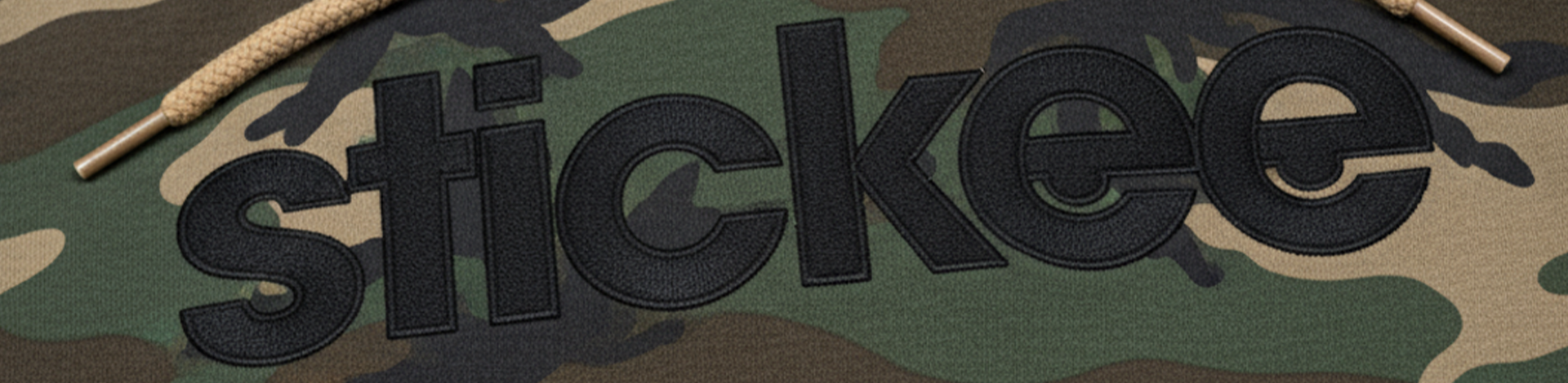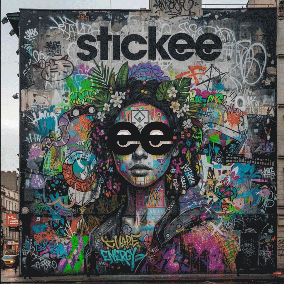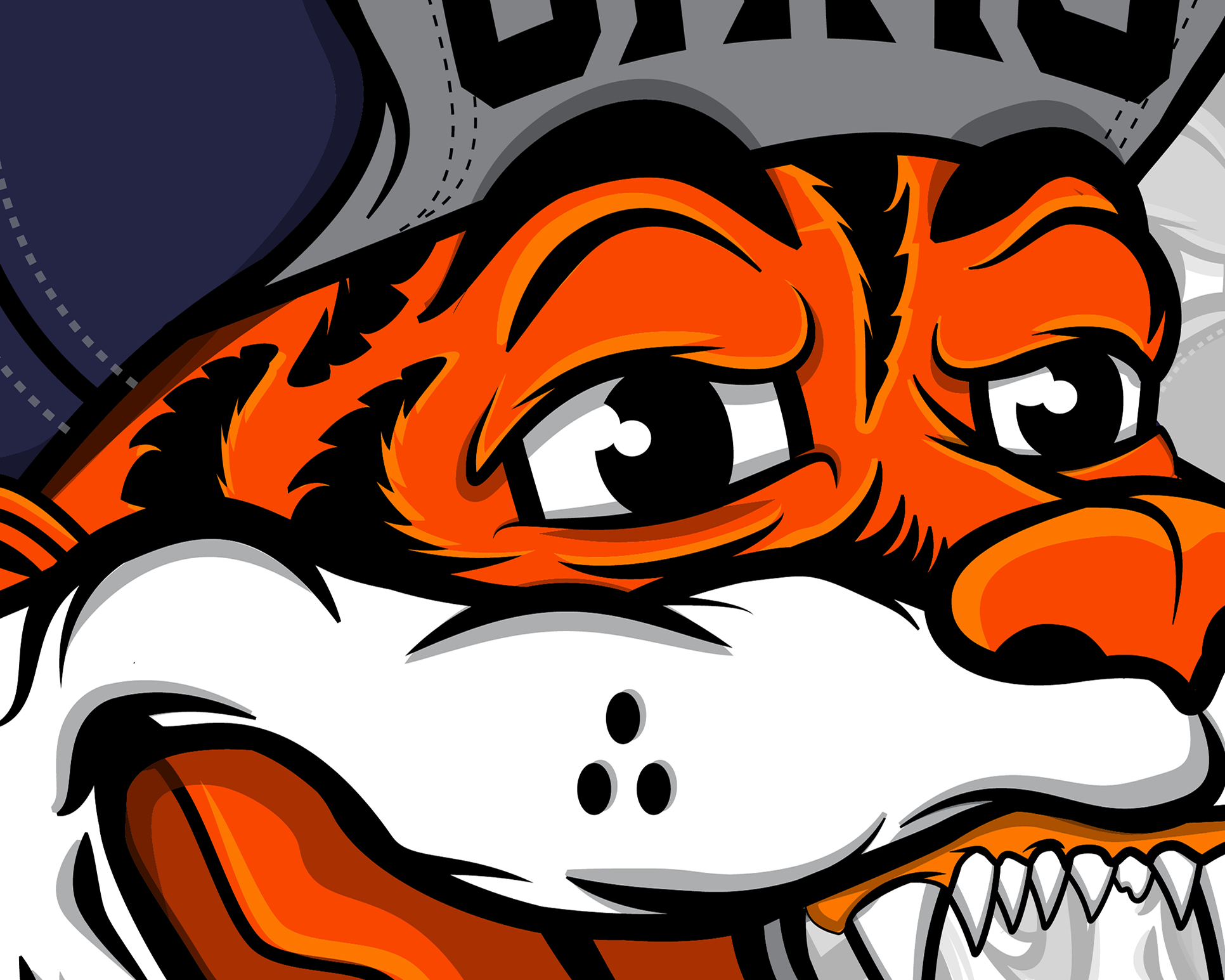

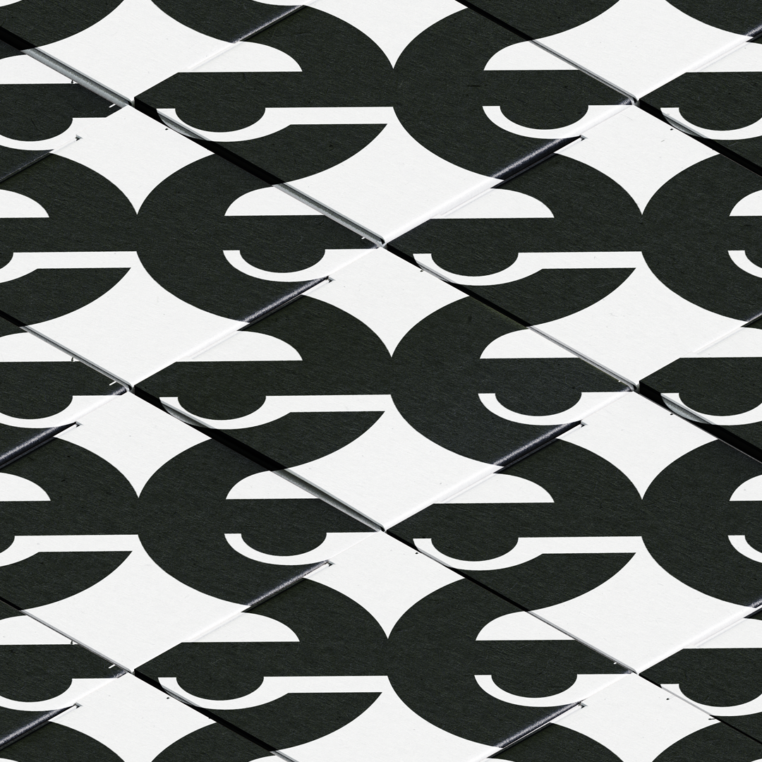
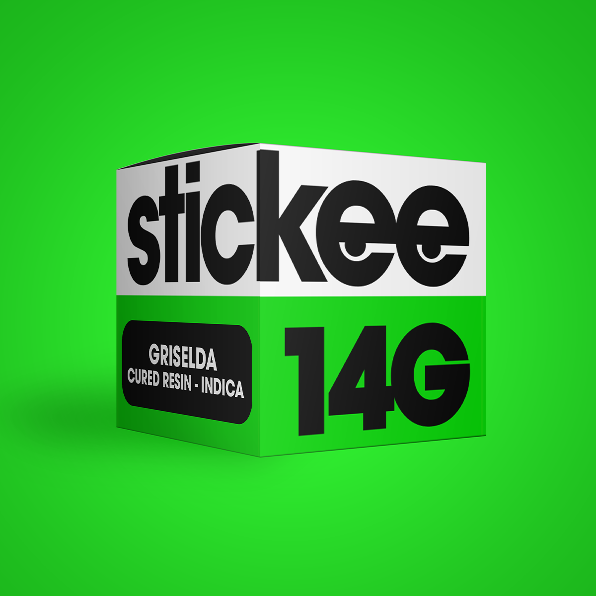
For the stickee logo and branding, I was given only the name and one direction “make it timeless.” With a short turnaround and full creative freedom, I leaned into what made the name stand out. The double “e” immediately caught my attention, and I transformed them into eyes, giving the logo character and an instant connection to the cannabis world.

The eyes were designed to look slightly “cashed” or “stoned,” adding a playful, laid-back energy that perfectly fits the brand’s identity. My goal was to keep the design simple, memorable, and versatile. Something that felt modern and clean, yet carried a subtle wink to the product’s roots. The final logo captures that balance: timeless, eye-catching, and unmistakably stickee.
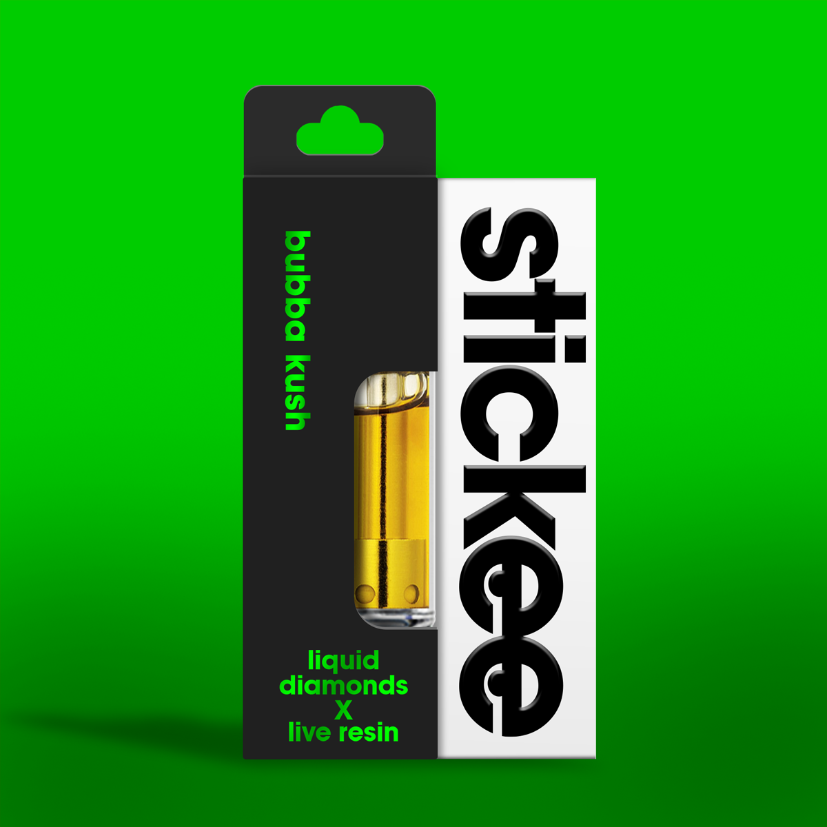
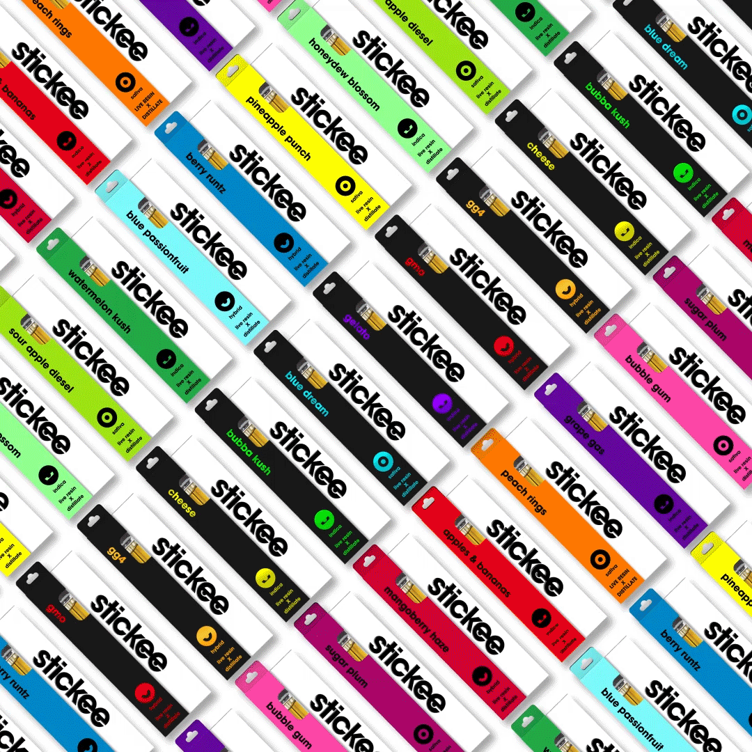
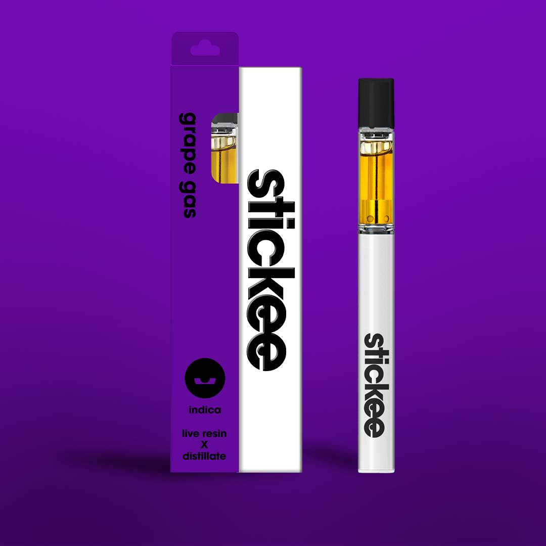
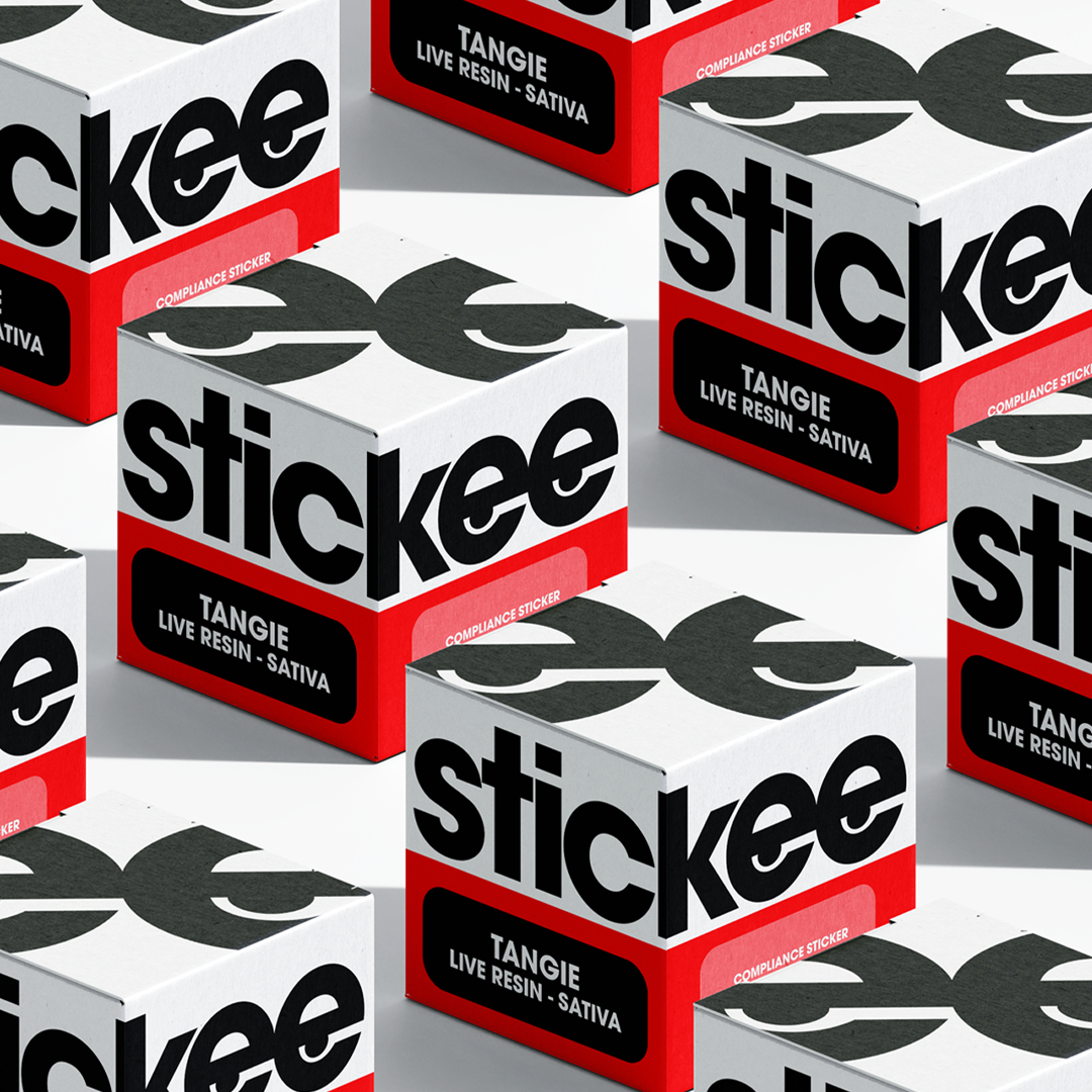
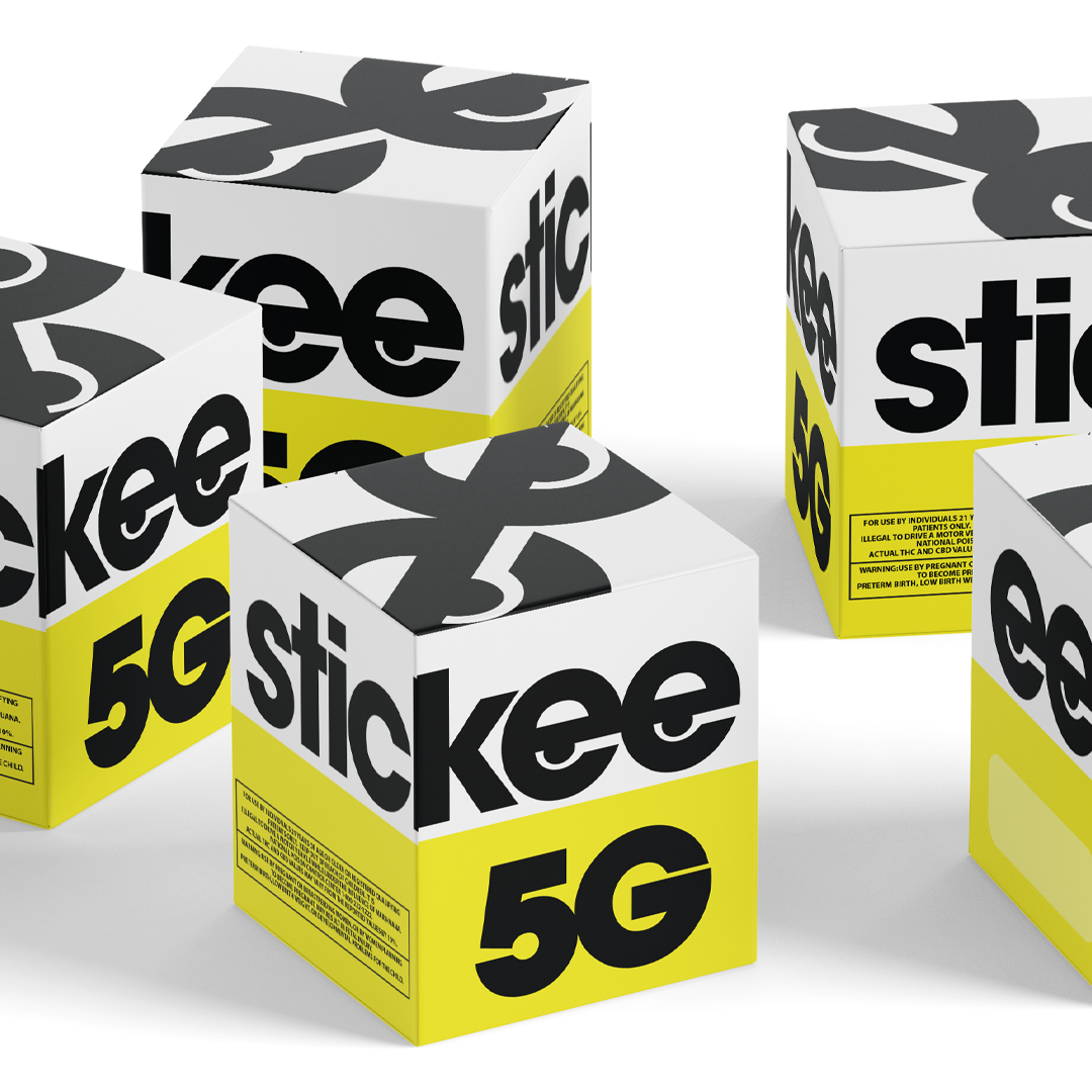
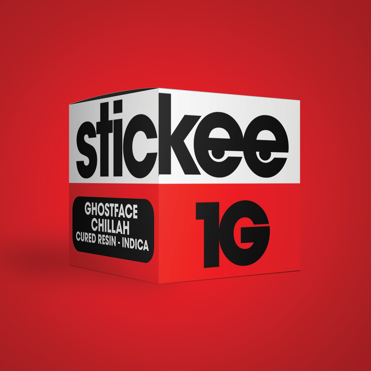
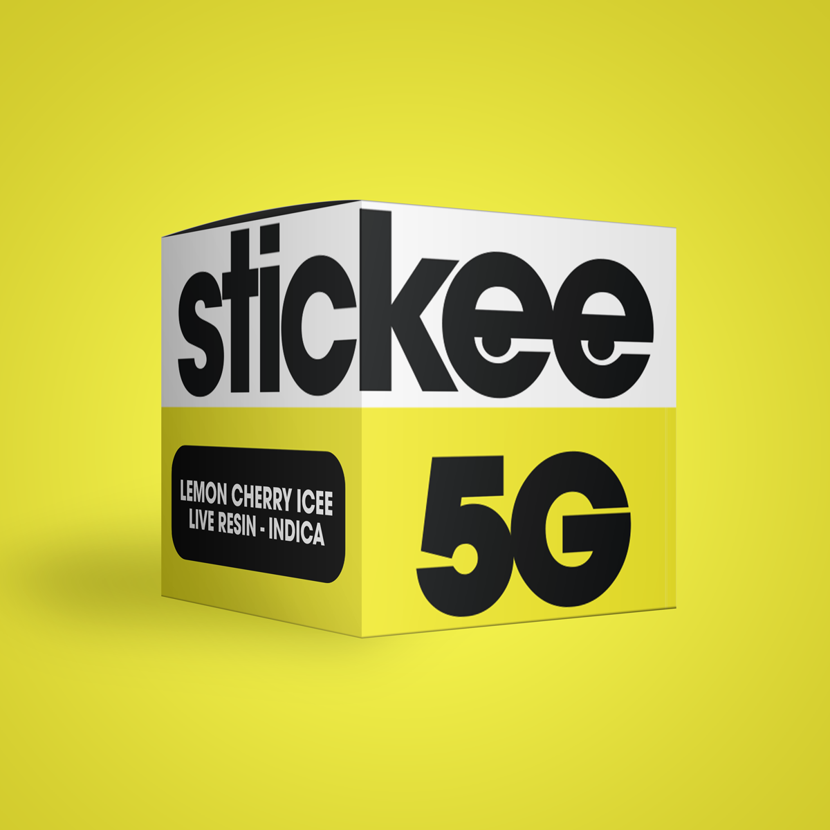
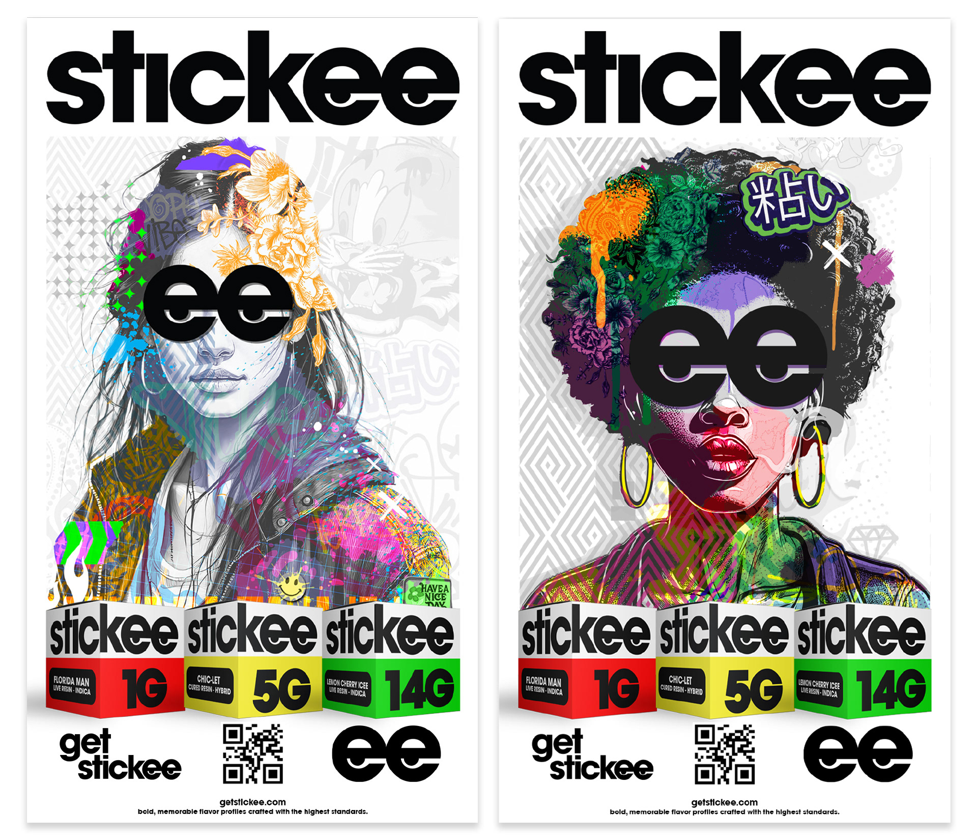
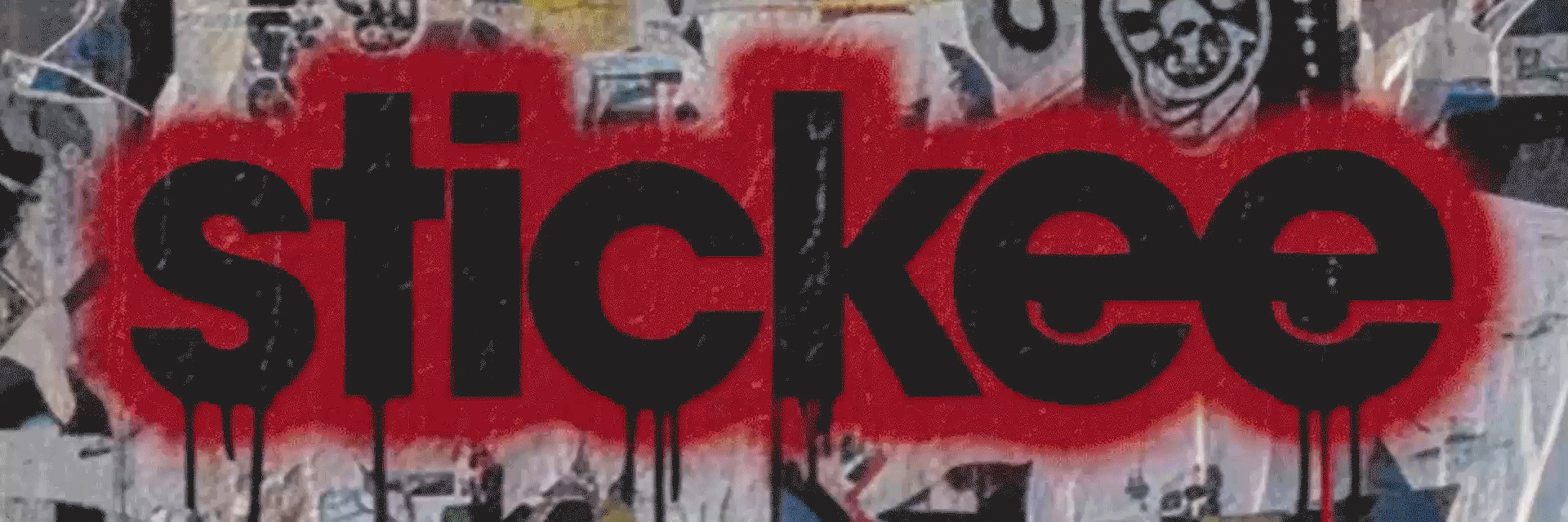
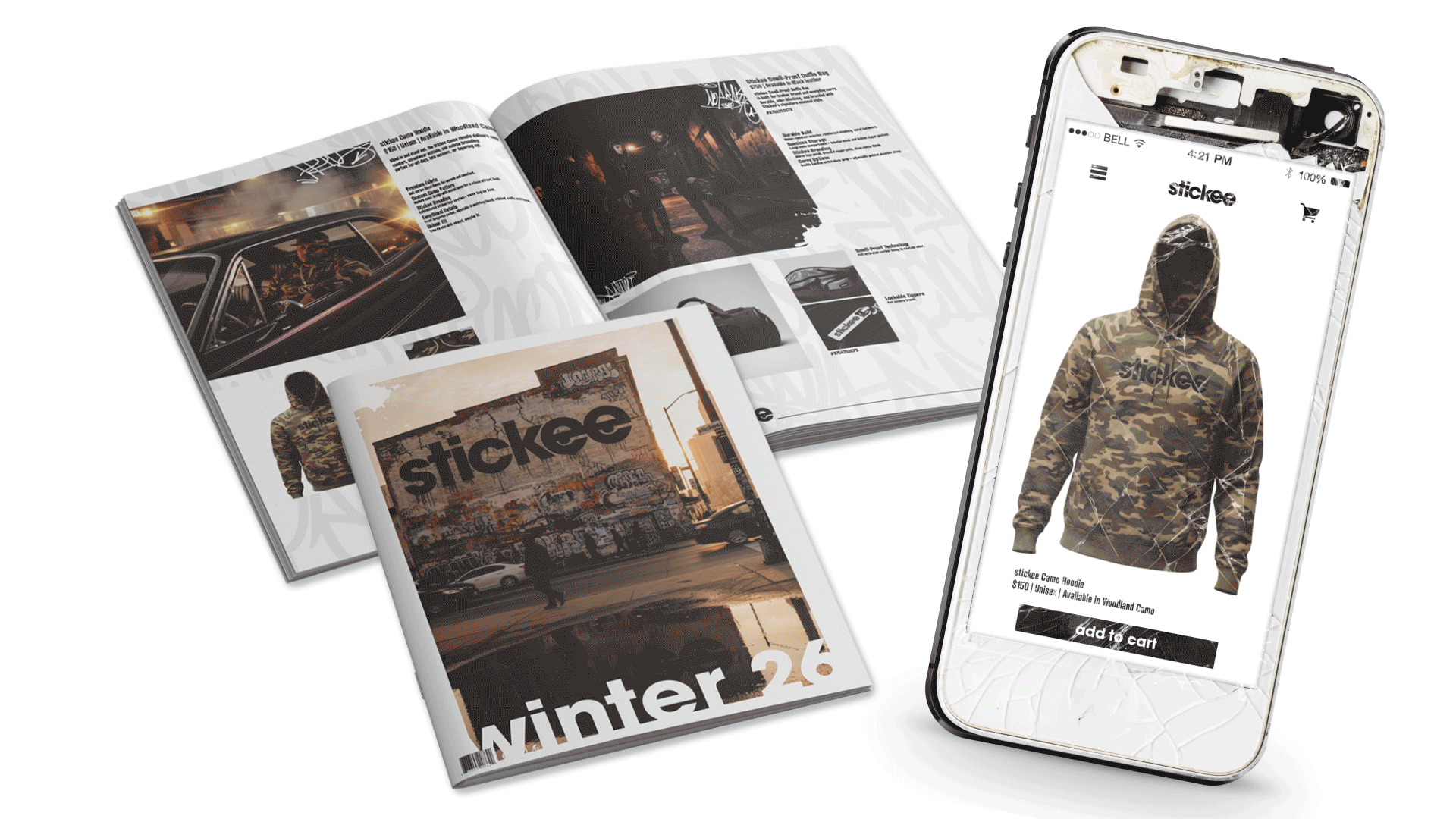
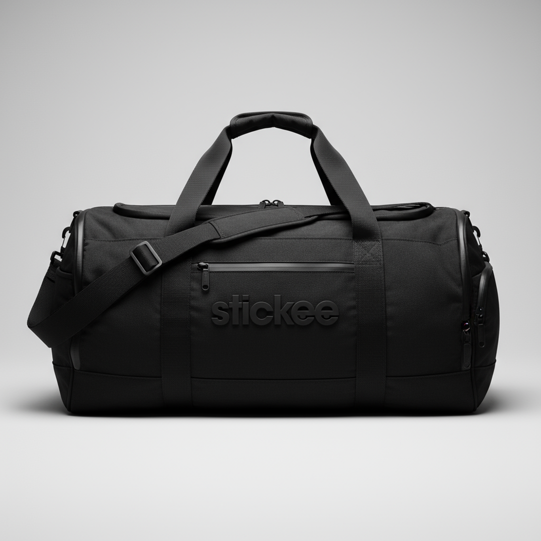
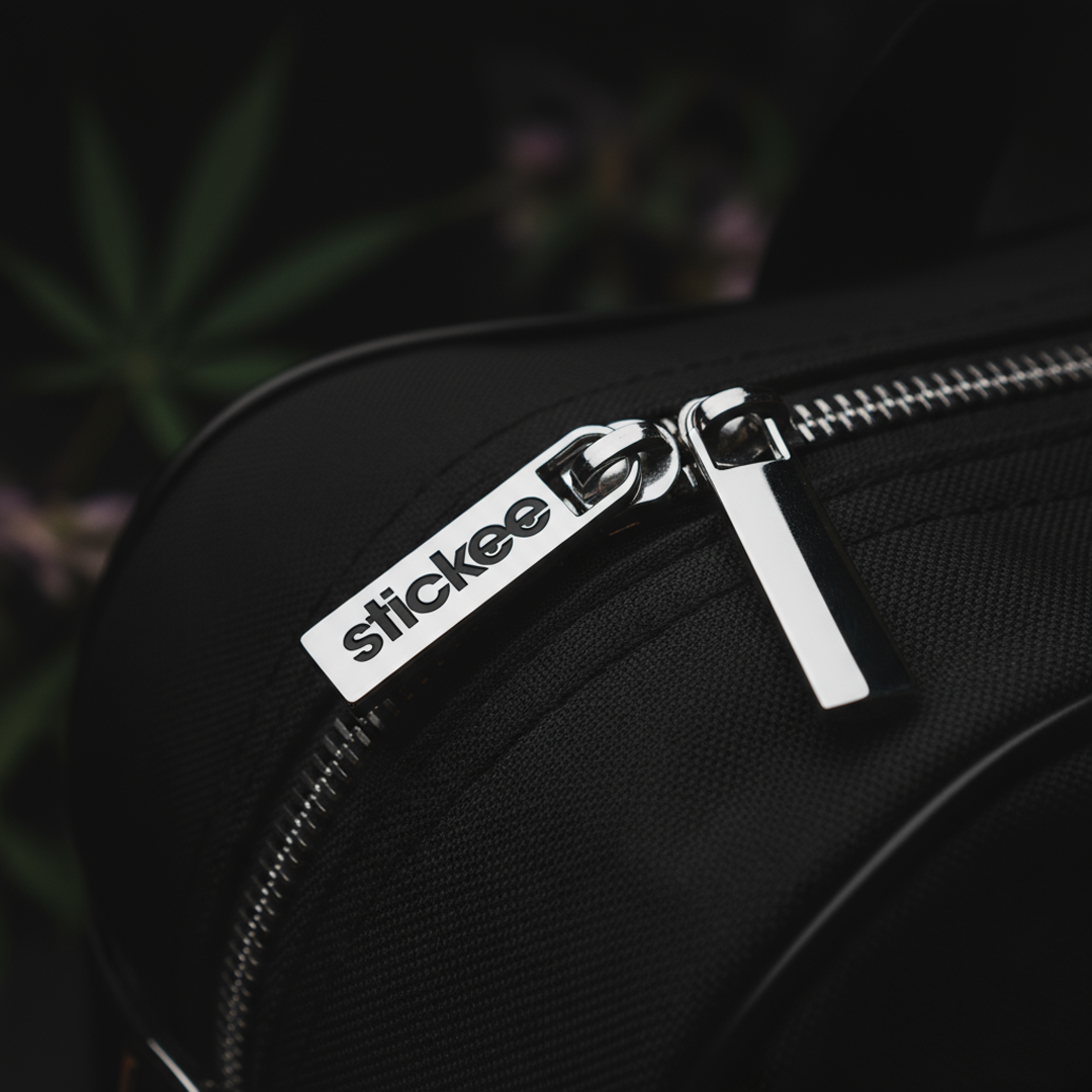
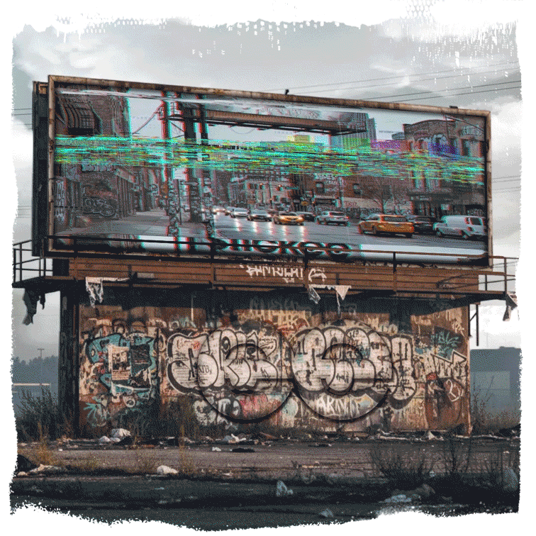
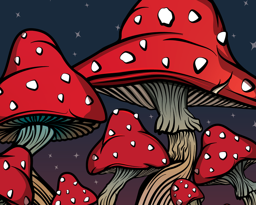
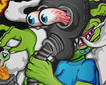
The following images were AI generated using Adobe Firefly, Nano Banana in Photoshop. Edited using photoshop and after effects. I liked this logo and wanted to use it for more than the failed vape company it was first intended for.